How to Build an Ecommerce Website From Scratch
Build an ecommerce website from scratch

Building a ecommerce website has become such a popular past time in recent years, it's now hard to imagine a future without it. The power of the internet has made connecting with customers a breeze for businesses and brands, and eCommerce, for the most part, is the easiest way to deliver products to their audience.
It's estimated that over 2.14 billion people will have shopped online in 2021 alone, and by 2025, its thought that 95% of all shopping will be done online. From artisanal soaps to hand-painted crockery, there's a market for every kind of online business.
Foundation's Building Blocks library of coded UI components are designed to make it easier to reach a final product faster. Unlike templates, Building Blocks don't dictate how your site should look or be structured. They simply provide you the tools to build up your own custom look and feel much faster.
In this article, you'll learn how to build a static eCommerce website from scratch using the eCommerce Kit, a curated collection of Building Blocks that are designed to help you build specific kinds of websites. Though this scaffold is a prototype, the Building Blocks we're using and layout we end up with can be applied to any system. For more on building your own website, check out our list of the best website builder our there.
Our top three pick of the best web builders
01. Ecommerce website building: getting started

The first thing we need to do is set up an environment to build the site. For this tutorial, you'll need to first download node.js. Once that's installed, you'll want to install the Foundation CLI using the command npm install -g foundation-cli.
Now that you have Foundation installed on your system, let's start up a new Foundation project by using the command foundation new ecommerce-site. In the list that follows, select the first option, 'A website (Foundation for Sites)', type in our project name 'ecommerce-site ', and then select 'ZURB Template'. This will start up a Foundation template and development server so that we can easily begin building our website. Run npm start in the terminal to run the project.
Next, let's take a look behind the code of our new project by opening it up in a text editor. In here, you'll find a sample page in 'src/pages/index.html' containing some default template material. We're going to remove all of the code here.
02. Ecommerce website: installing a Kit
Before we write any code, we're going to pull in Foundation's eCommerce Kit with Foundation's CLI. Head to your terminal and use the command foundation kits install ecommerce.
If this command doesn't work, double-check that your Foundation CLI is updated to 2.2.3. To check which version you're on, run foundation -v in your terminal. If you need to update, simply uninstall the CLI with npm uninstall -g foundation-cli and reinstall it with npm install -g foundation-cli.
This just downloaded all of the Building Blocks inside of our eCommerce Kit! Any time you install a Building Block, it will appear in src/partials/building-blocks. You'll know that your Kit installed correctly if all of the Building Blocks have been automatically imported into your app.scss file.
Some of these Building Blocks include icons from Font Awesome, so you'll want to either manually install them or add their CDN to the <head> of your site. To do this, navigate to src/layouts/default.html and add <link href="https://cdnjs.cloudflare.com/ajax/libs/font-awesome/4.7.0/css/font-awesome.css" rel="stylesheet"> between the <head> tags.
03. Ecommerce website: scaffolding the site

Let's get to building! With our Kit installed, these next couple of steps will feel a bit like playing with LEGO: in your own projects, you can choose to use all of them, or you can use just a selection. Feel free to mix and match Building Blocks to achieve your dream eCommerce layout.
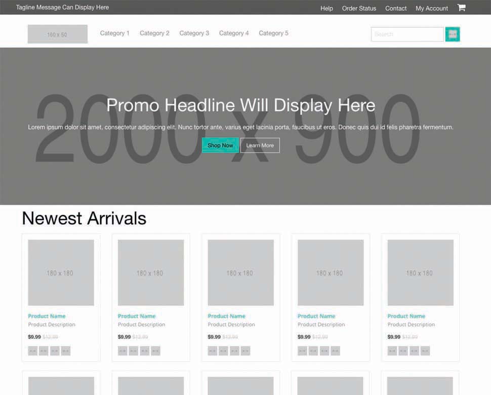
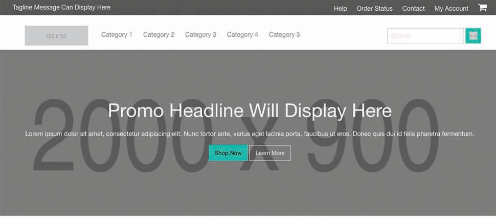
For this tutorial, the first two Blocks we'll start with are header and promo hero. To do this, we're going to use the Handlebars partial mechanism. In our empty index.html file, let's throw in the partials {{> ecommerce-header}} and {{> ecommerce-promo-hero}}. With just these two Building Blocks, our eCommerce landing page already looks about half-way done.
Next, we'll throw in some product cards below our hero section. To use the product card Building Block, we'll use Foundation's block grid so that the cards sit evenly within a grid. This will also make it easier to change the layout of these cards later.
Let's start with <div class="row small-up-2 medium-up-5">. Inside this div, throw in ten columns with the product card inside of each column <div class="column">{{> ecommerce-product-card}}</div>.
We want to give our customers a way to get to more of our products, so let's add a callout button beneath our product cards. First we need to create our <div class="row column text-center"> so that our button will be centred on the page. Next, we'll use the Foundation button component to create our callout. Add a <button class="button">Shop All Products</button> inside of the .row.column.
The page feels almost complete now, but let's also add a header between our hero and product cards to give a little bit of context. Under the hero, add a <div class="row column"> to contain our header <h1>Newest Arrivals</h1>.
Most eCommerce home pages have more promotional content below their products. Let's use the Building Block {{> ecommerce-hero-slider-small}} here. To prevent the slider from spanning the width of the page, we will wrap it around a <div class="row column">.
Since eCommerce sites typically consist of many pages, most will require a mega footer with lots of links to handle the volume of pages. Our eCommerce Kit comes with a footer for this exact use case. To wrap up this scaffold, let's drop in the {{> ecommerce-footer}} at the very bottom of our HTML.
04. Ecommerce website: check for responsiveness
These days, it's hard for any site to get by without being mobile-friendly. This is especially true for eCommerce sites. Now that online shopping has become the norm, we don't want to lose that percentage of users who do this through their mobile phones.
Following our motto of mobile-first, Foundation's Building Blocks are built to be naturally responsive. A quick check on a smaller screen shows that our site is still looking pretty good.
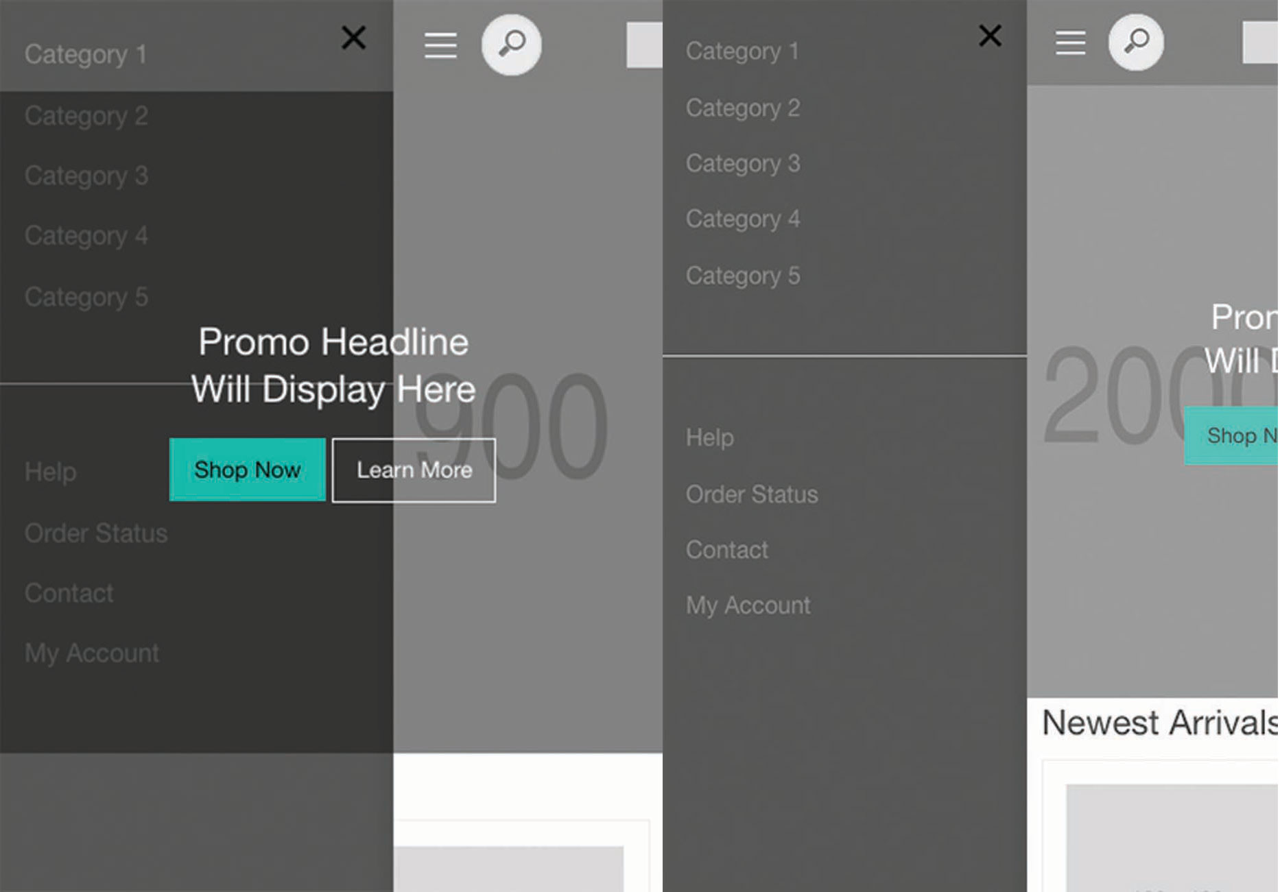
However, when we click on the hamburger menu, our off-canvas hasn't been properly hooked up. This part gets a little tricky, but don't worry! We'll break down what's happening in this off-canvas menu and then walk through how to hook it up.
If you take a look into the ecommerce-header.html file, you'll notice that this header has an off-canvas built into it. So, why didn't it work? When we clicked on the hamburger menu, the only thing that was 'pushed' was the header. The rest of the page remained in view, causing some strange overlapping.
This is because this header was built to work on its own, but in reality it needs to work with the entire page. In other words, it needs to push all of the content on the page over when the off-canvas menu is triggered, not just the header menu. This ecommerce-header was written like this because setting up an off-canvas requires diving into your src/layouts/default.html page, which is beyond the Building Block's reach.

To fix this, all we need to do is take everything inside of <div class="off-canvas ecommerce-header-off-canvas position-left" id="ecommerce-header" data-off-canvas> and move it into src/layouts/default.html. Next, we're going to wrap the {{> body}} of our site inside of a <div class="off-canvas-content" data-off-canvas-content>. This will push the body of our site when off-canvas is triggered.
Now when we click on our hamburger, the entire site moves over for the off-canvas menu! The body of our default.html page should look like this:
<body> <div class="off-canvas ecommerce-header-off-canvas position-left" id="ecommerce-header" data-off-canvas> <button class="close-button" aria-label="Close menu" type="button" data-close> <span aria-hidden="true">×</span> </button> <ul class="vertical menu"> <li class="main-nav-link"><a href="categories.html">Category 1</a></li> <li class="main-nav-link"><a href="#">Category 2</a></li> <li class="main-nav-link"><a href="why.html">Category 3</a></li> <li class="main-nav-link"><a href="build.html">Category 4</a></li> <li class="main-nav-link"><a href="#">Category 5</a></li> </ul> <hr> <ul class="menu vertical"> <li><a href="#">Help</a></li> <li><a href="#">Order Status</a></li> <li><a href="#">Contact</a></li> <li><a href="#">My Account</a></li> </ul> </div> <div class="off-canvas-content" data-off-canvas-content> {{> body}} </div> <script src="{{root}}assets/js/app.js"></script> </body> We've shown you how to jump-start your eCommerce site with Foundation's eCommerce Kit, but don't stop there! There are over 100 Building Blocks that can be used to help enhance your pages. In a matter of minutes, we've scaffolded a static eCommerce site with Building Blocks. This saves you a great deal of time that you can now use to layer in the visuals and style the site to fit your brand.
Even if you're taking this further and using a back-end system, different partial mechanism or have another way of getting your data into the site, the given workflow with Building Blocks will really save you time and therefore money. Foundation's Building Blocks are a great way to get started because they're meant to be extended upon, fit into your existing styles, and be used in any application system.
This article originally appeared in net magazine issue 266.
Related articles:
- Build a card-based UI with Foundation
- 10 beautiful new ecommerce sites you must see
- How to improve the performance of ecommerce sites
Related articles
How to Build an Ecommerce Website From Scratch
Source: https://www.creativebloq.com/how-to/build-an-ecommerce-site-from-scratch